
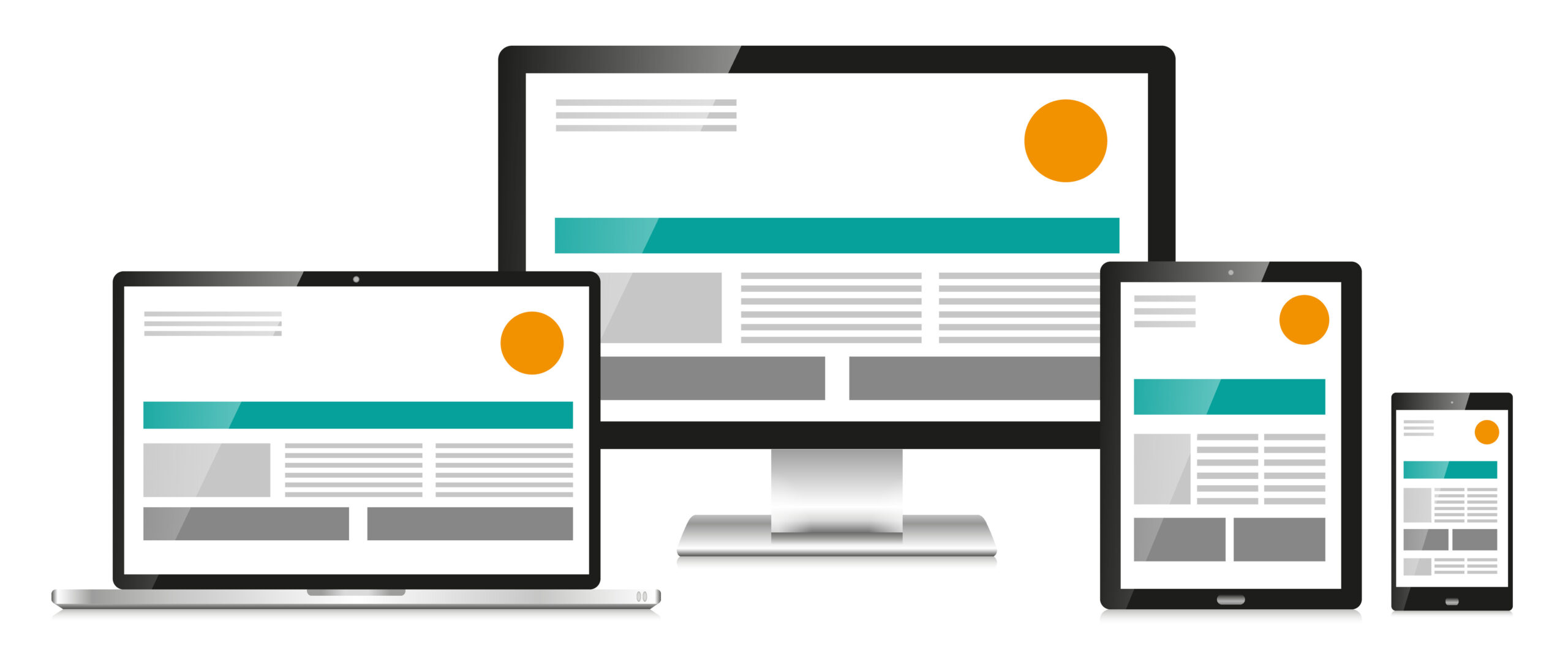
I once asked our professor in class what the difference was between Responsive and Adaptive web design. Ever since he offered up an explanation, I have been obsessed with evaluating various websites and trying to determine in which camp they fall. In a nutshell, Responsive Web Design (RWD) is a complex, however graphically pleasing and super user-friendly method of designing a website and its subsequent viewing on devices of all sizes and aspect ratios to ensure a company’s website is dynamic and optimally shown with high usability to its end users. More specifically, the different components of the page resize and “reshuffle” to fit the screen. (Schade, 2014) Some examples of really great Responsive design in sites I use every day include:
The User Journey
I honestly believe a web designer would miss the mark if they don’t at least consider this method if they aren’t planning to build a standalone Mobile-based app that would function as a subset of the Desktop features. For example, consider the following use-case:
Tammy is planning the ultimate Girlfriend’s getaway to Vegas. She is so excited that she pulls up one of her favorite travel sites on her iPad upon awakening one morning. She logs in to her account and starts perusing the vacation destinations on the homepage while sipping her morning coffee. She is so engrossed in all of the amazing hotel and attractions’ photos she realizes she’s lost time and needs to run for the train. Once she’s on the train, she pulls out her mobile phone to continue her search, bookmarks a few hotel selections and shoots a text to her girlfriends. When she gets to the office, her schedule is full so she has to wait till lunchtime to book! She pulls up the travel site on her desktop, pulls up her bookmarks, glances at her text message, and smiles. She is ready to make the reservations and her crew is fully on board!
In this example, the experience navigating to the same site, but on three different devices with different dimensions was seamless! The relevant information was served up, the taxonomy was familiar and the architecture of the design was intuitive.
Why Good Web Design is Not Just Important, but Essential

When we look at the continued growth of digital and the number of eCommerce transactions around the world, it only makes good sense to consider these transactions are occurring on any preferred device. For example, in a report shared by Datareportal.com, more than 4.57 billion people around the world use the internet and these numbers are growing at a rate of about 8% every year. Of these internet users, 81% search online for a product or service, and almost 75% make a purchase. (DataReportal, 2020) As these numbers continue to grow and as the types of devices become more and more varied, the website creators are tasked with finding creative and technological  ways to make the site user-friendly, easy to navigate and supportive of the company’s goals, whether that’s the dissemination of information or transactional in nature.
Let’s Consider
- What examples of great RWD have you come across recently?
- In the sites without RWD, were you able to accomplish your goal of visiting that company’s website? Why or why not?
References
- DataReportal. (2020, July). Global Digital Overview – DataReportal – Global Digital Insights. Retrieved from https://datareportal.com/global-digital-overview
- Kirkwood, J. (2018, February 26). 11 Powerful Examples of Responsive Web Design. Retrieved from https://www.invisionapp.com/inside-design/examples-responsive-web-design/
- Schade, A. (2014, May 4). Responsive Web Design (RWD) and User Experience. Retrieved from https://www.nngroup.com/articles/responsive-web-design-definition/